Emily Jing Sum Chan
Parsons Type Design Class of Spring 2020
Follow on Instagram
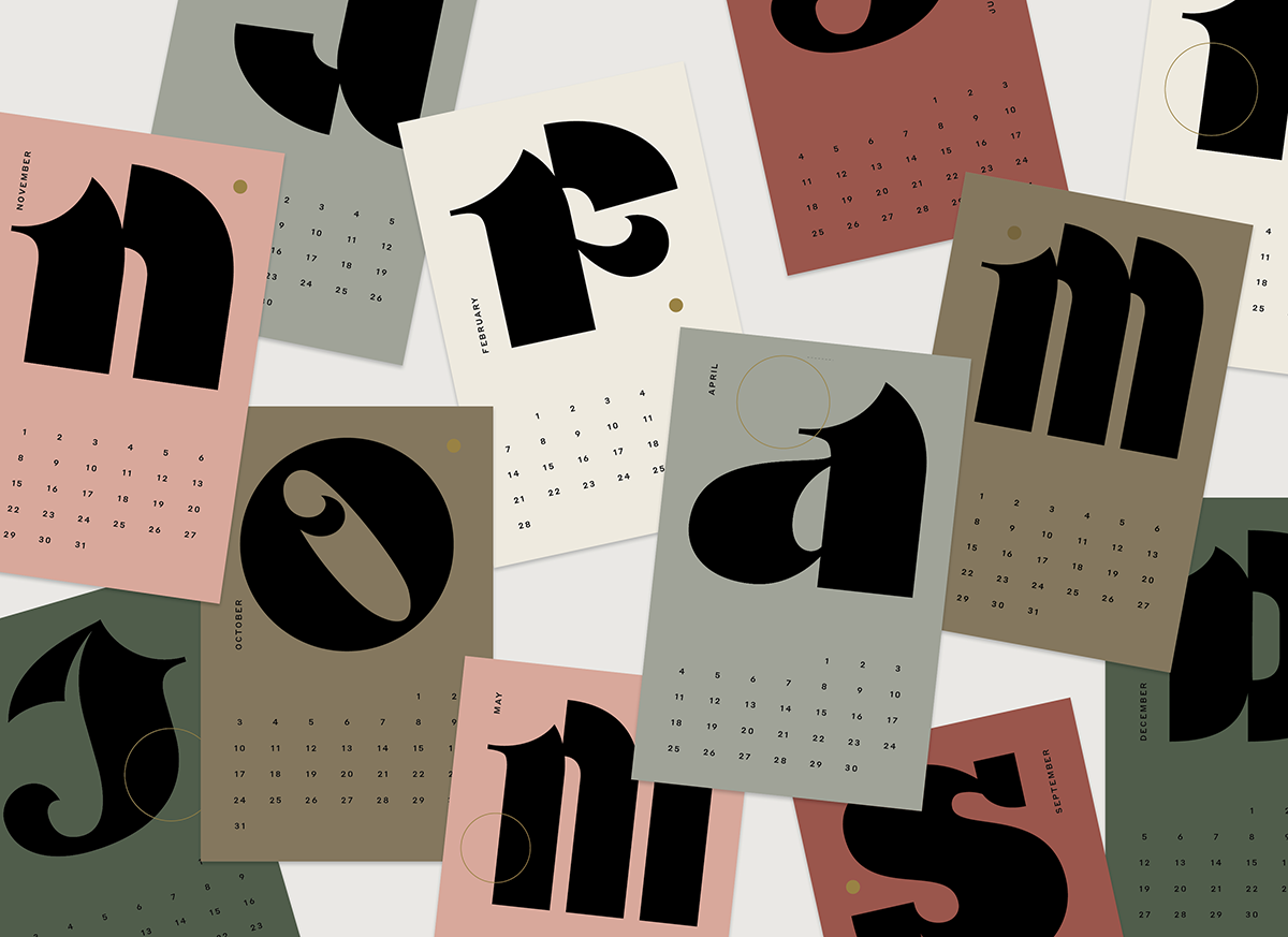
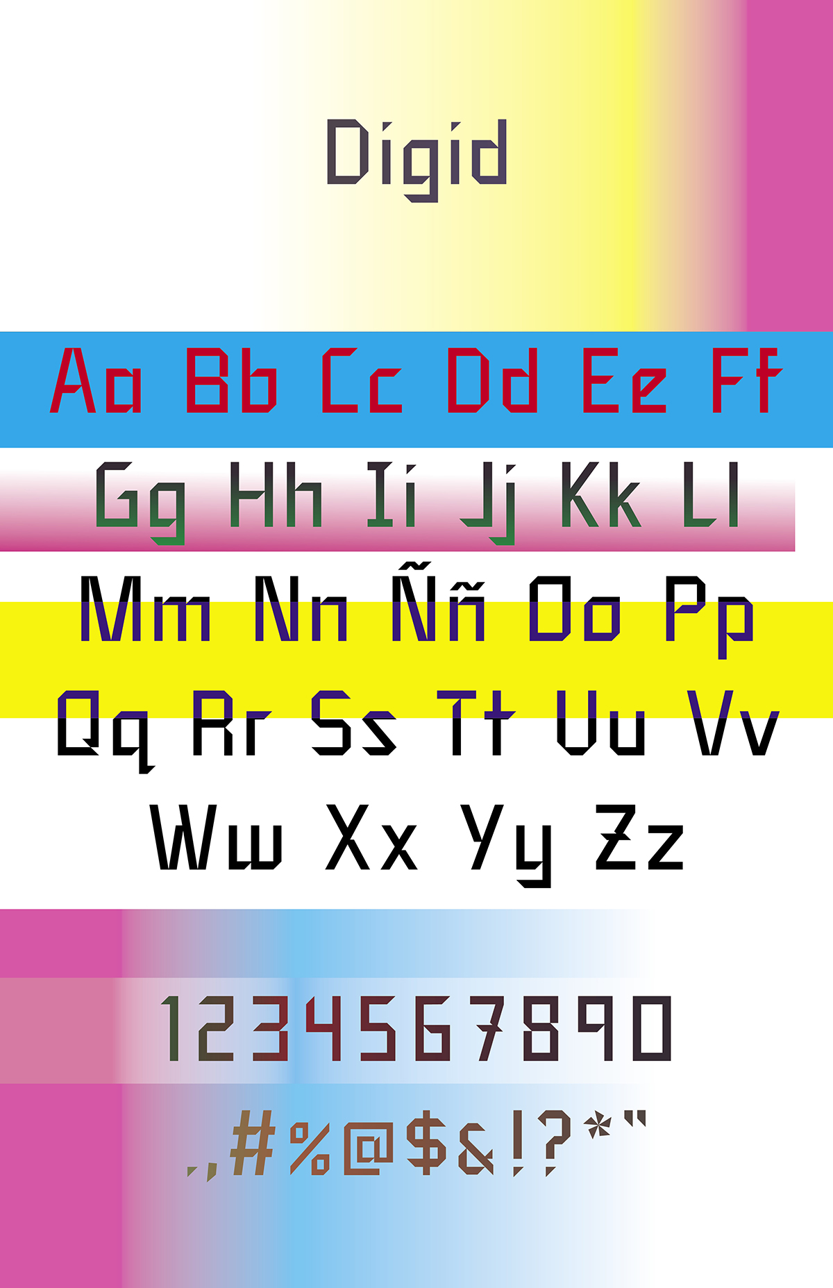
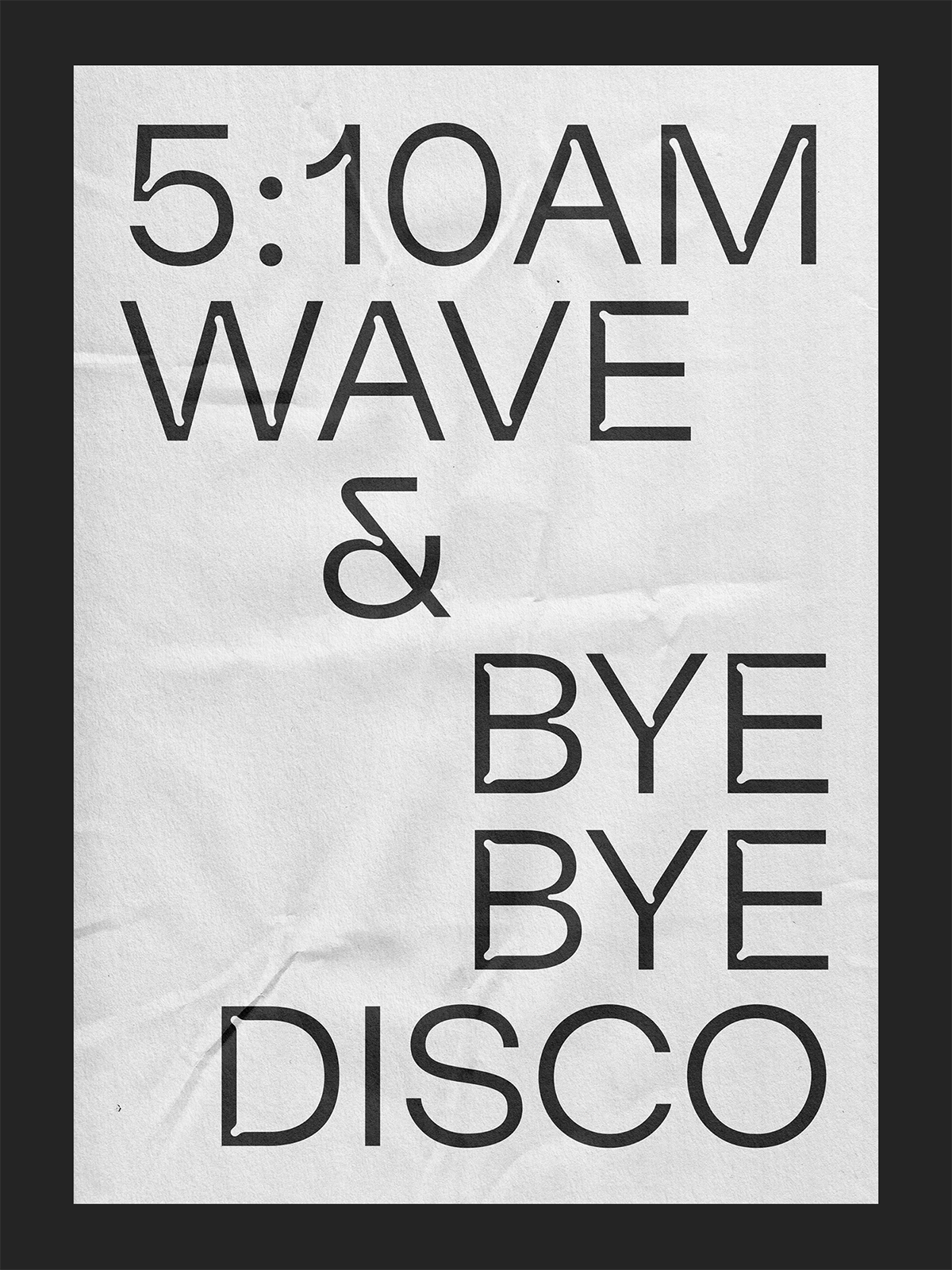
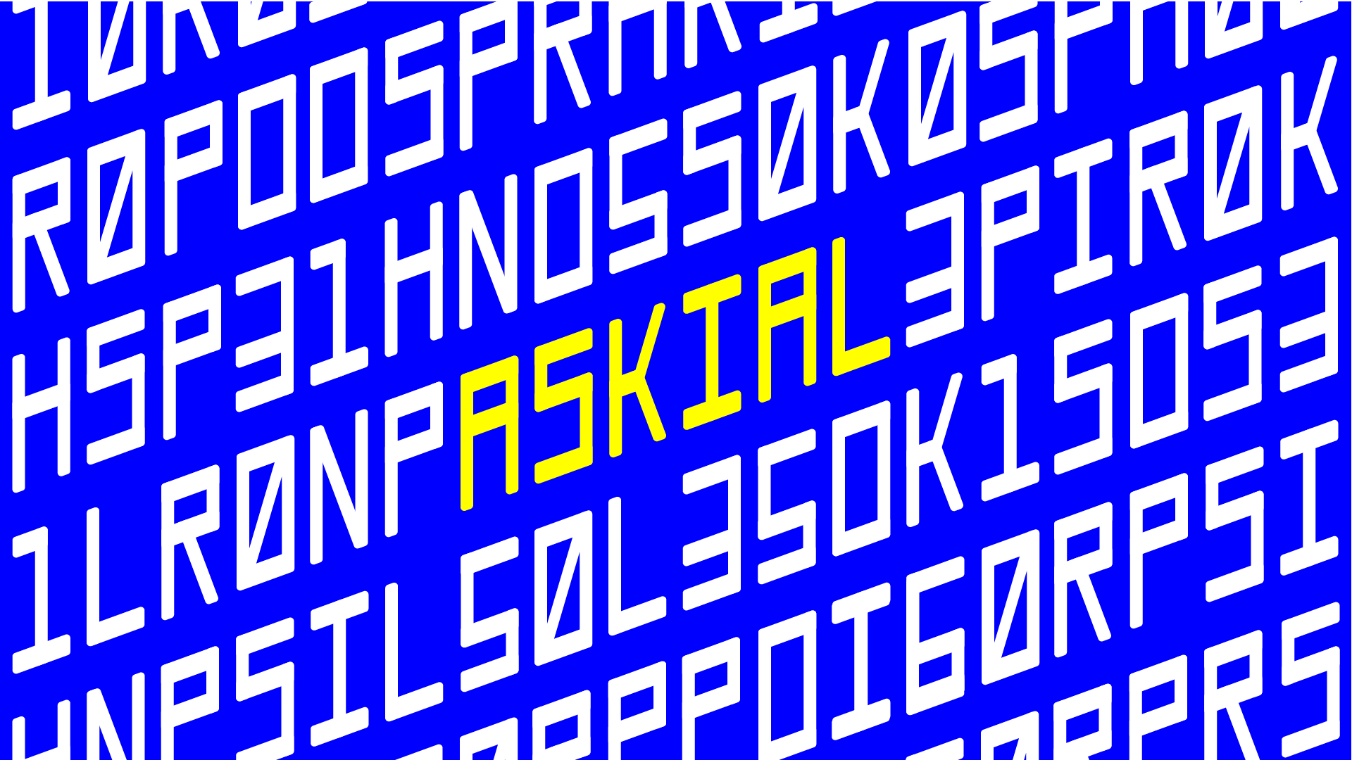
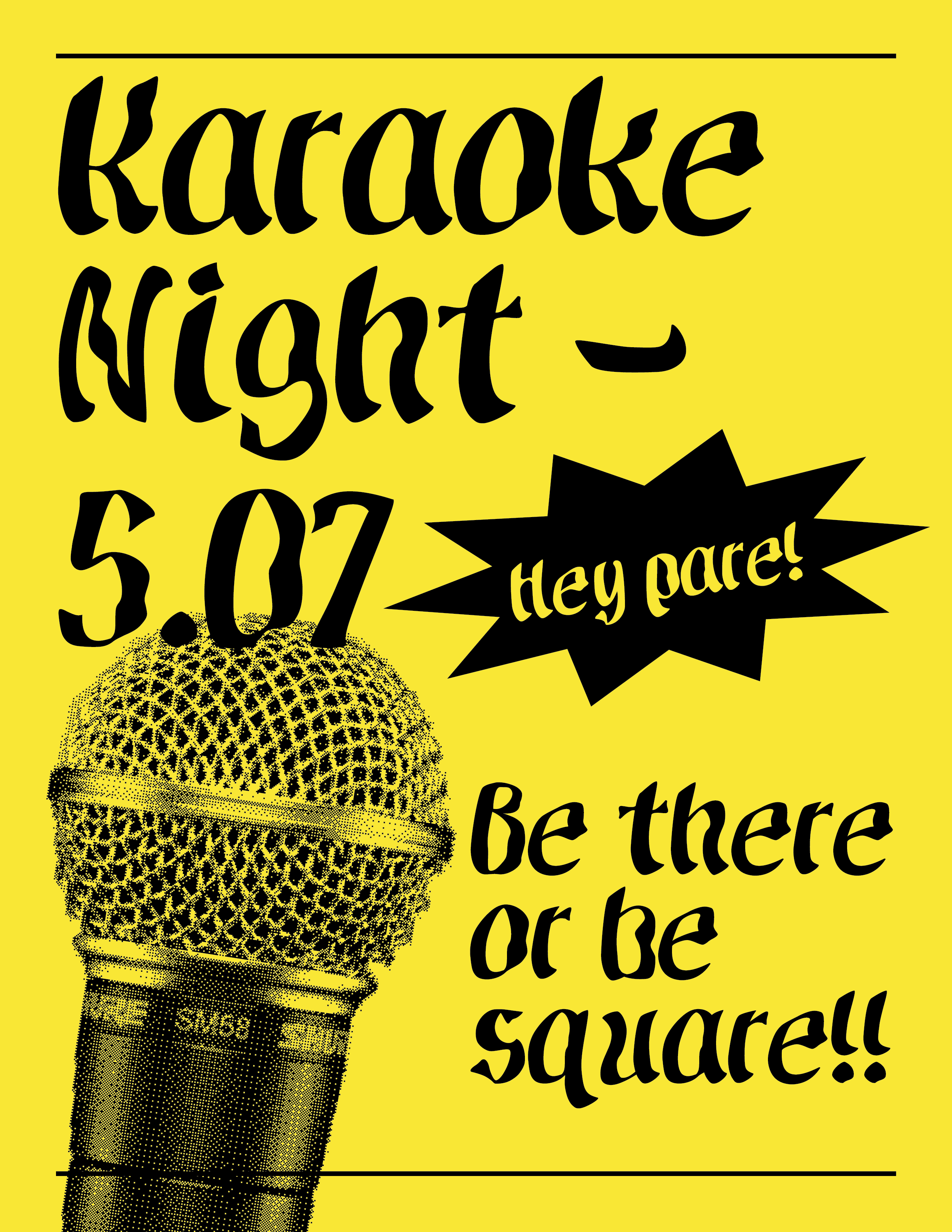
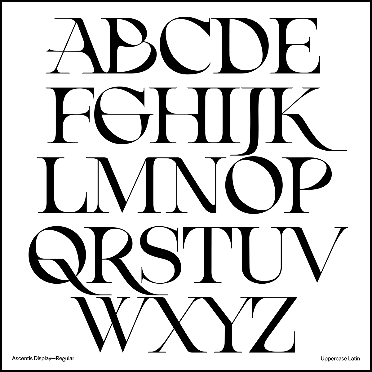
Ascentis Typeface Project
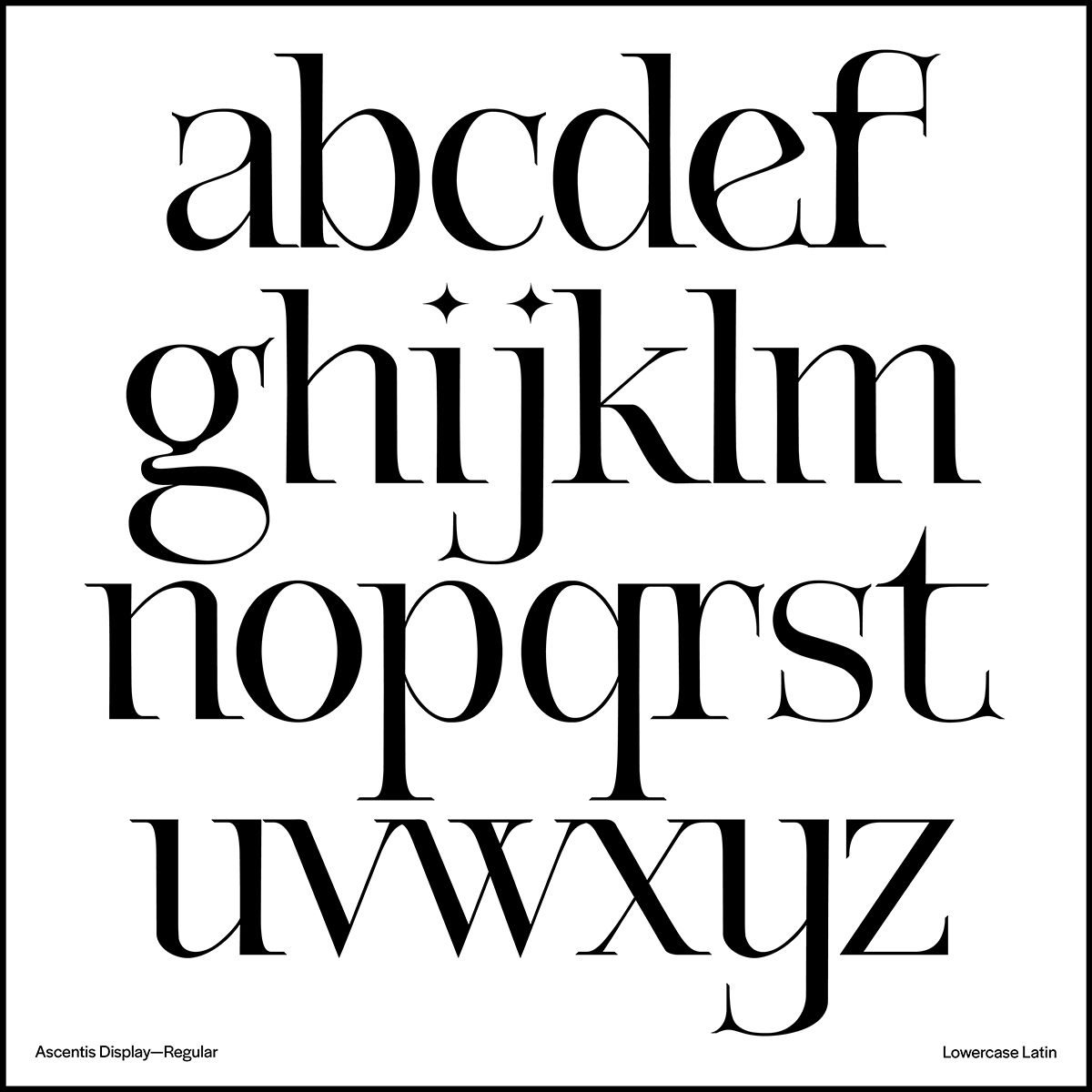
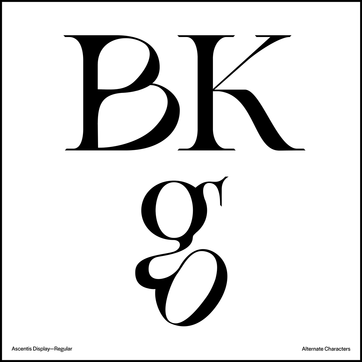
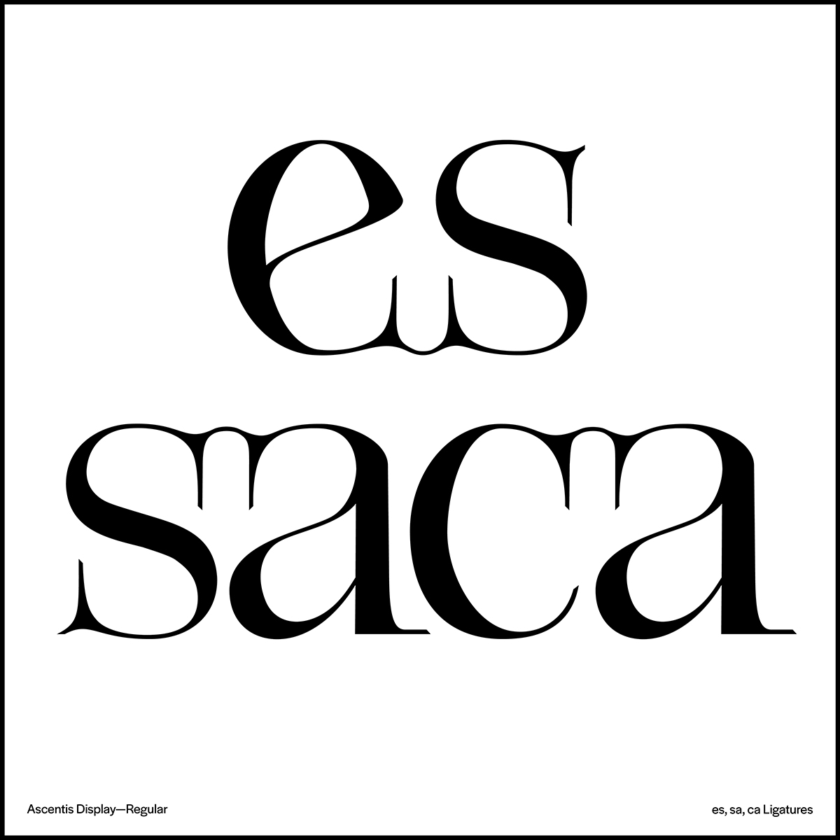
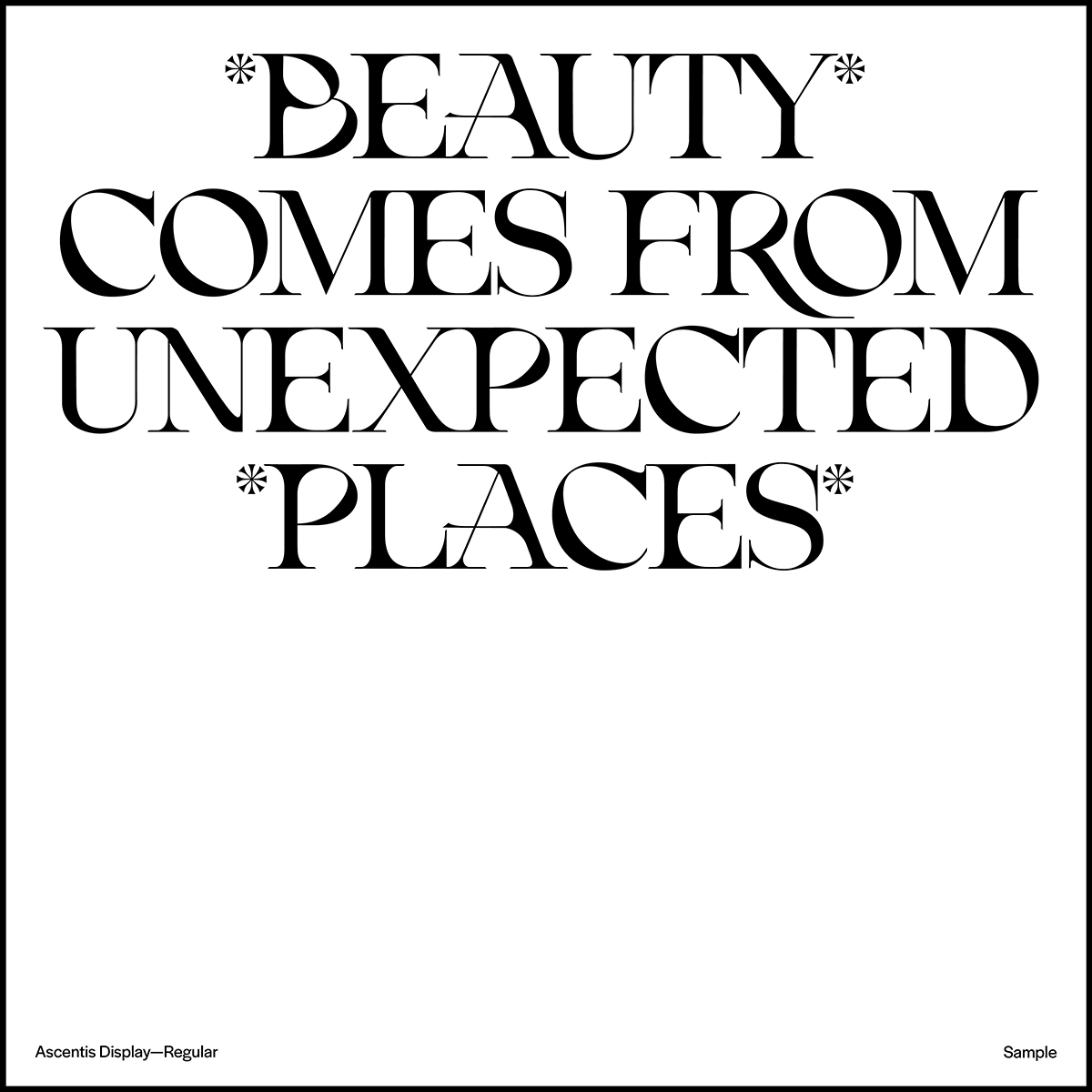
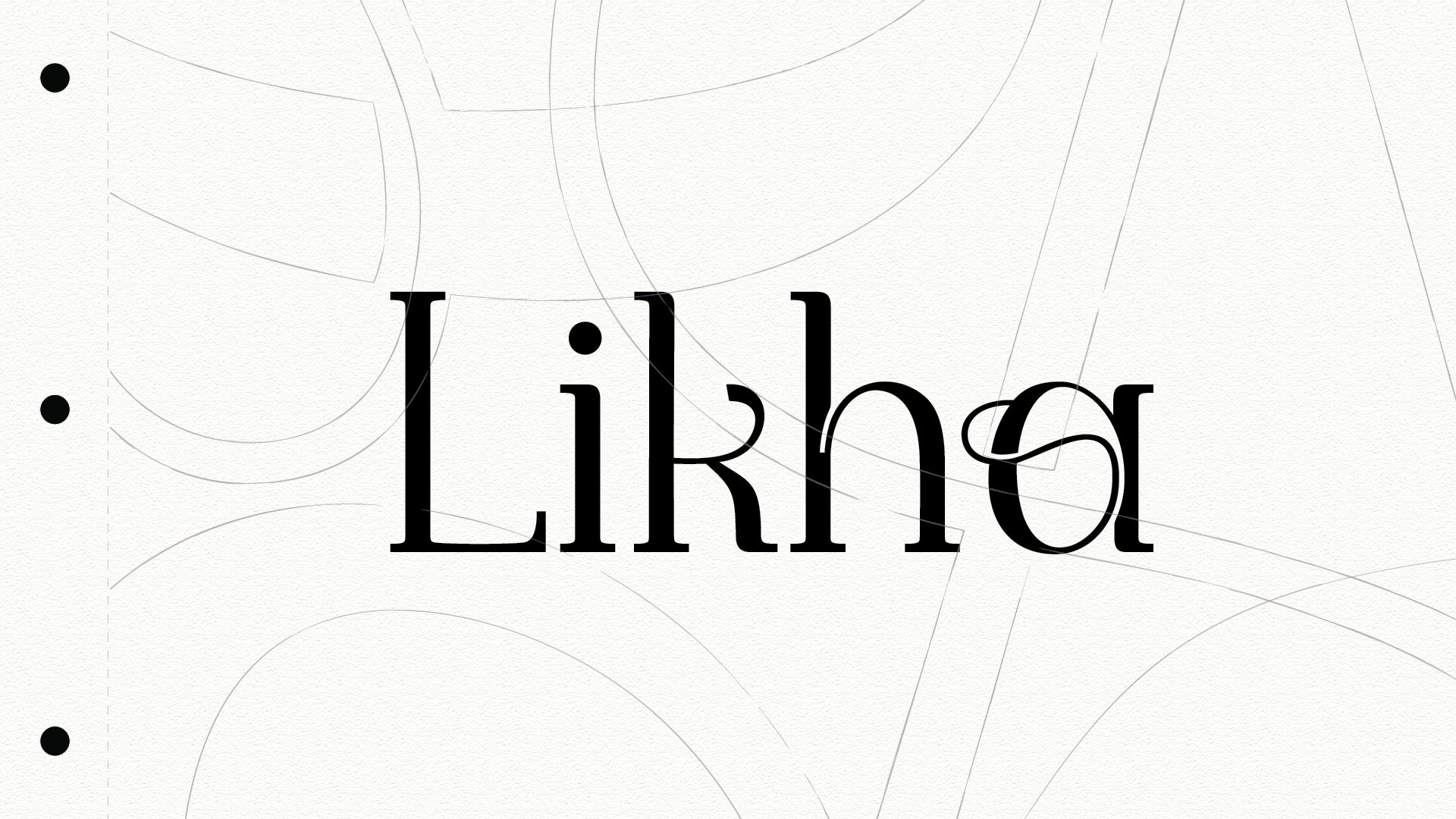
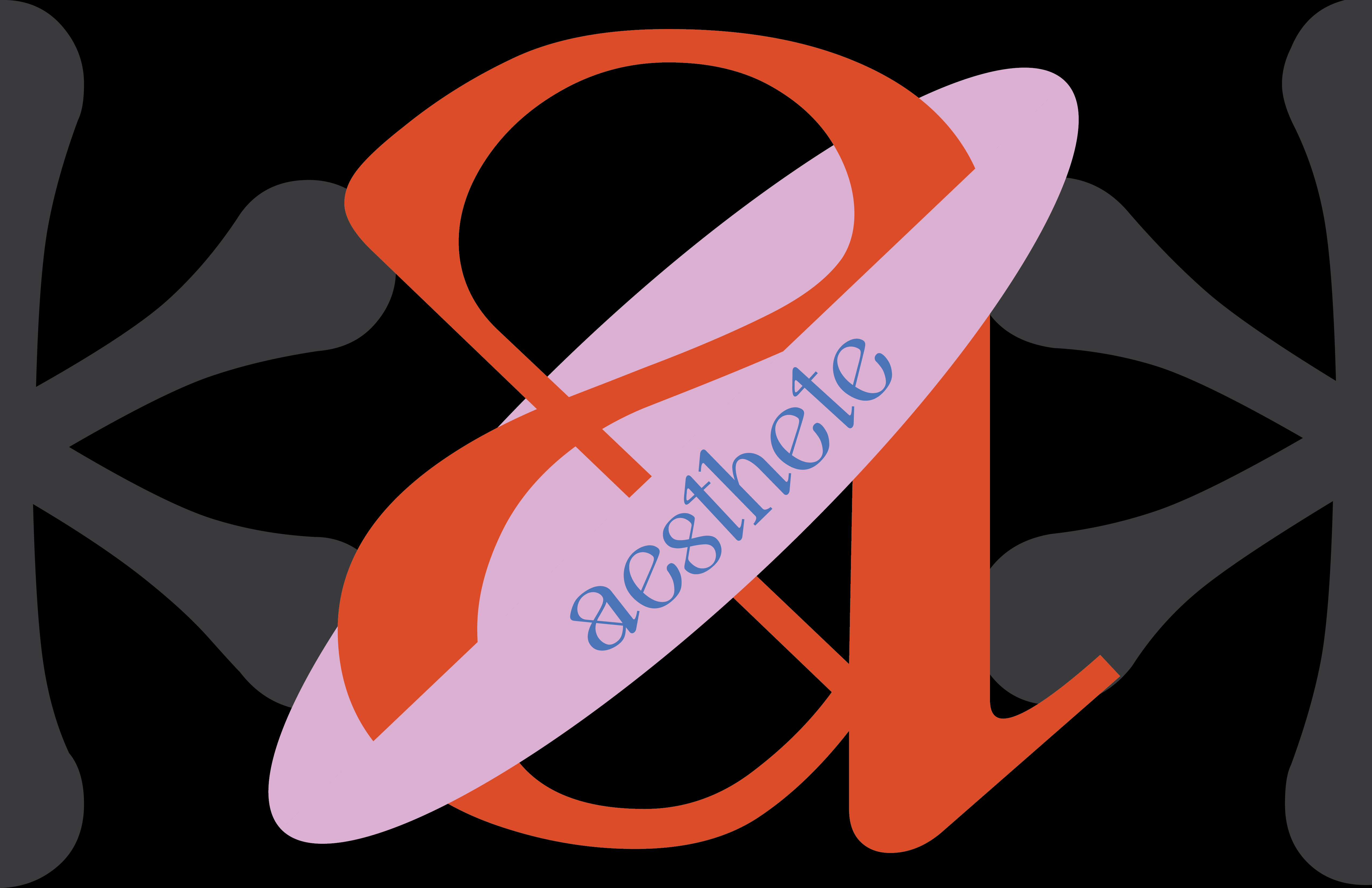
Ascentis falls in the realm of display typefaces inspired by Neoclassical typography, sprinkled with a contemporary twist. The serifs and contrast between thick and thin strokes pays its respects to Neoclassical typography. Yet the experimental star-shaped terminals offers a stinging sensation; and the intense, deep curvatures allows the letterforms to melt into their respective spaces. This seamless fusion of sharp and smooth, historical and modern, creates an emphasized edge to Ascentis’ fluidity and unconventional character. Ascentis not only visually acknowledges the history of Typography, but also pushes the boundaries of what typographic conventions can be.